CASE 02 — 2022
PRODUCT / PACKAGING / 3D / CONSUMER

byte

A six-product oral-care kit designed to feel medical without being clinical — and to survive a year on the shelf.

Open black healthy habits box showing oversized white byte wordmark and oral-care products inside

Context

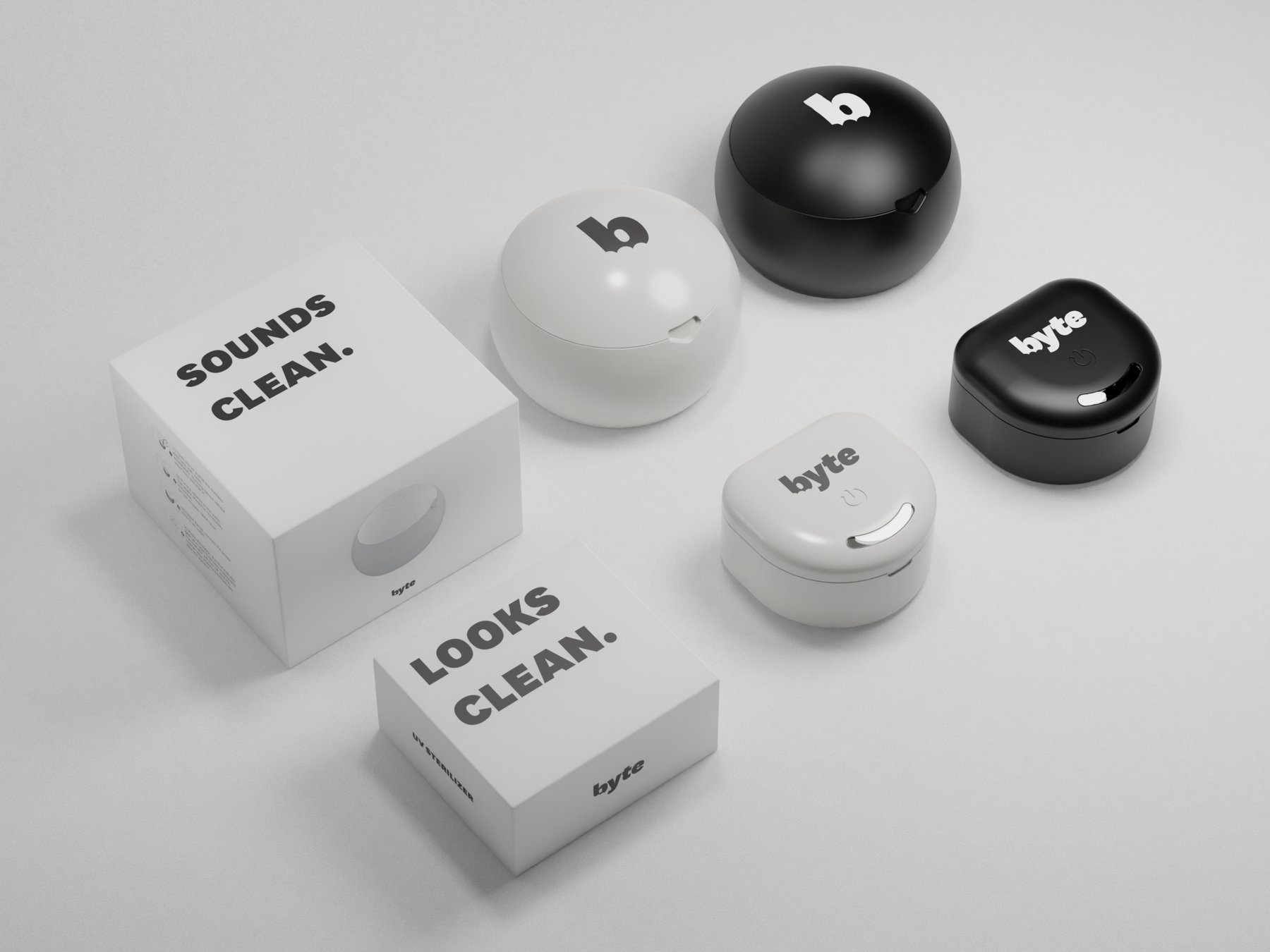
byte is a US direct-to-consumer dental brand best known for its clear aligners. The hygiene kit was an adjacent product — six physical objects, packaged together, intended to anchor a subscription that otherwise mostly arrives in mailers. Its packaging is the brand’s most physical touchpoint with the customer.

Problem

The kit had to bridge two contradictory tones at once: medical (precise, certified, trustworthy) and consumer (warm, inviting, anti-clinical). The same box would meet a first-time customer at the front door and live in a bathroom cabinet for a year.

Design decisions

One kit, six functions

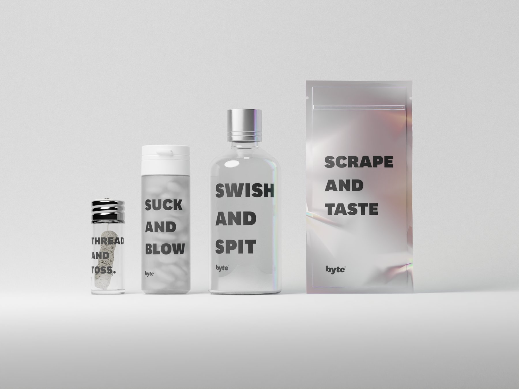
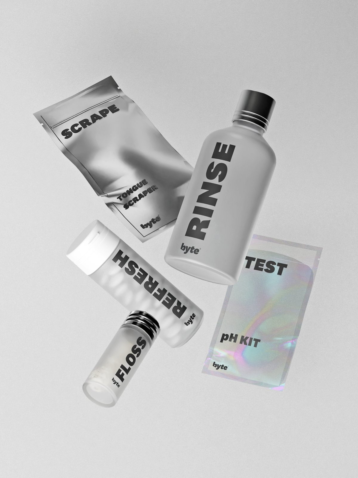
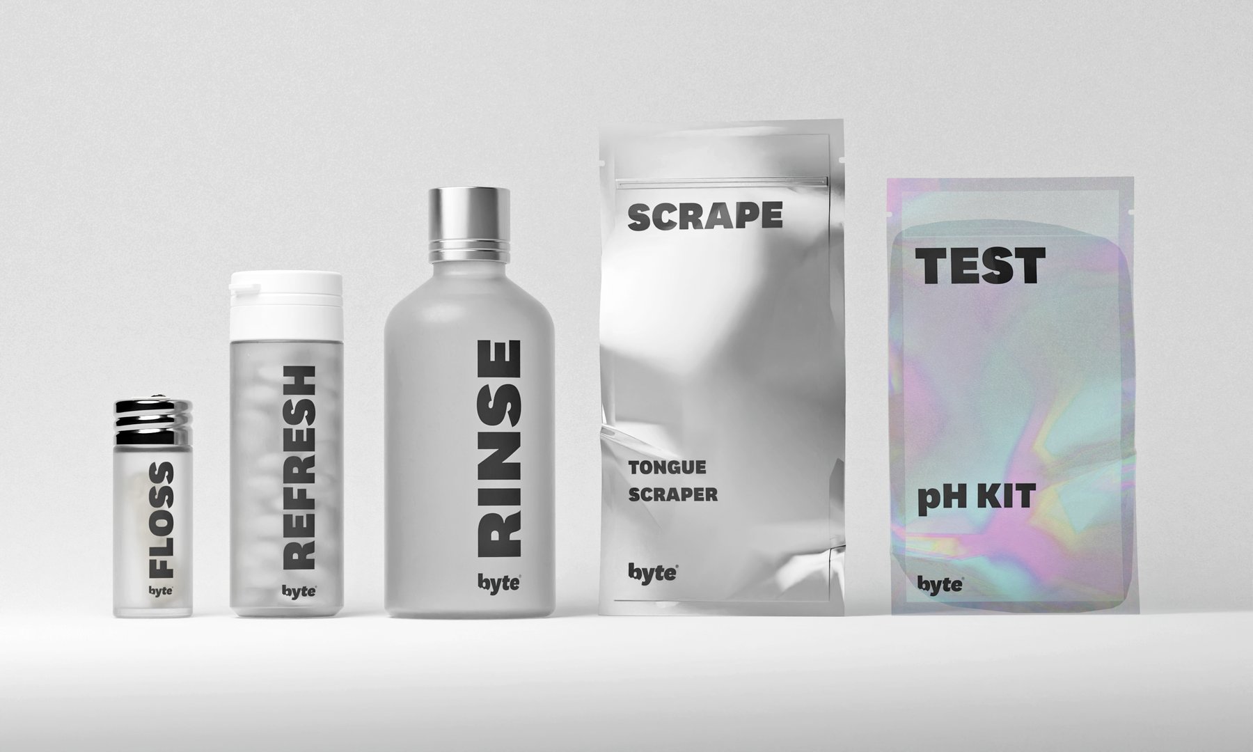
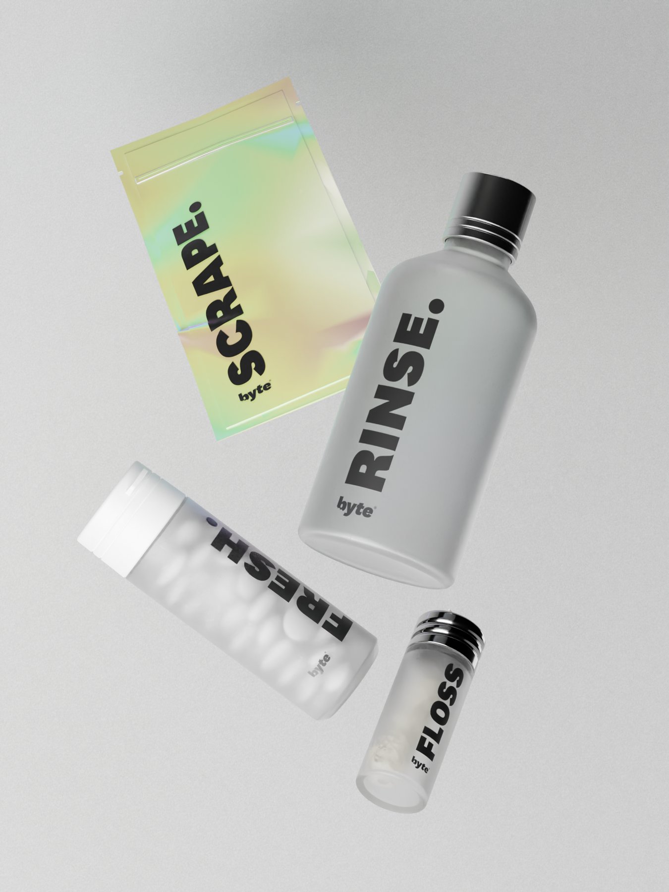
The hygiene kit contained six distinct products — Tongue Scraper, Rinse, Floss, Test, Refresh, pH Kit — each with its own use cycle and its own visual identity within the system. Each pouch and bottle read as part of the same family while making clear at-a-glance which was which. Six labels, one alphabet.
byte oral-care products lined up on marble — tongue scraper, floss, and rinse bottlesbyte kit products on wood — tongue scraper, floss, and rinse bottles

Same lineup, softer ground

A third surface test — linen instead of stone or timber — checked whether the matte black bottles and white scraper still read as one kit when the stage warmed up. The objects stayed clinical; the ground did the consumer work.

byte kit products on fabric — tongue scraper, floss, and rinse bottles

Black box, white interior

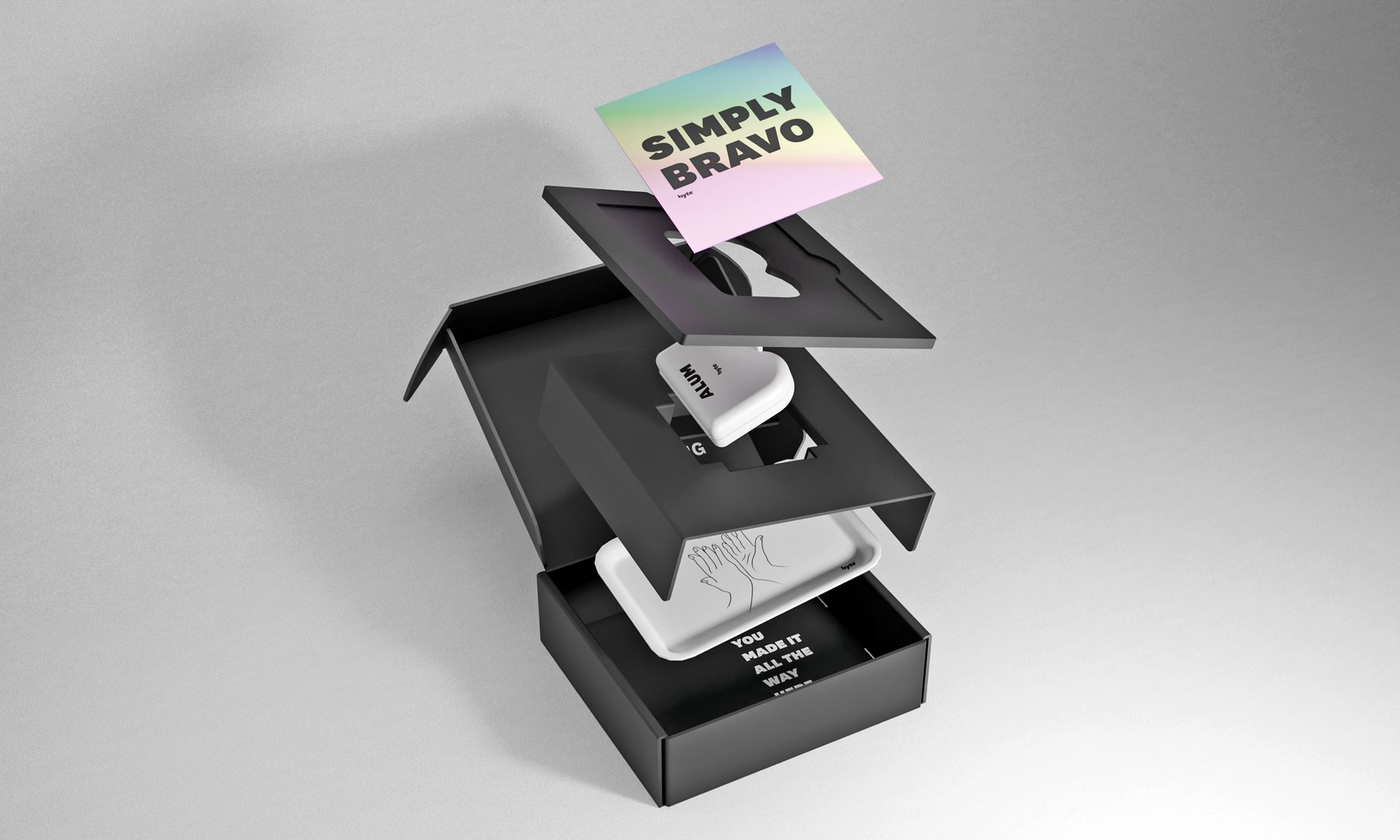
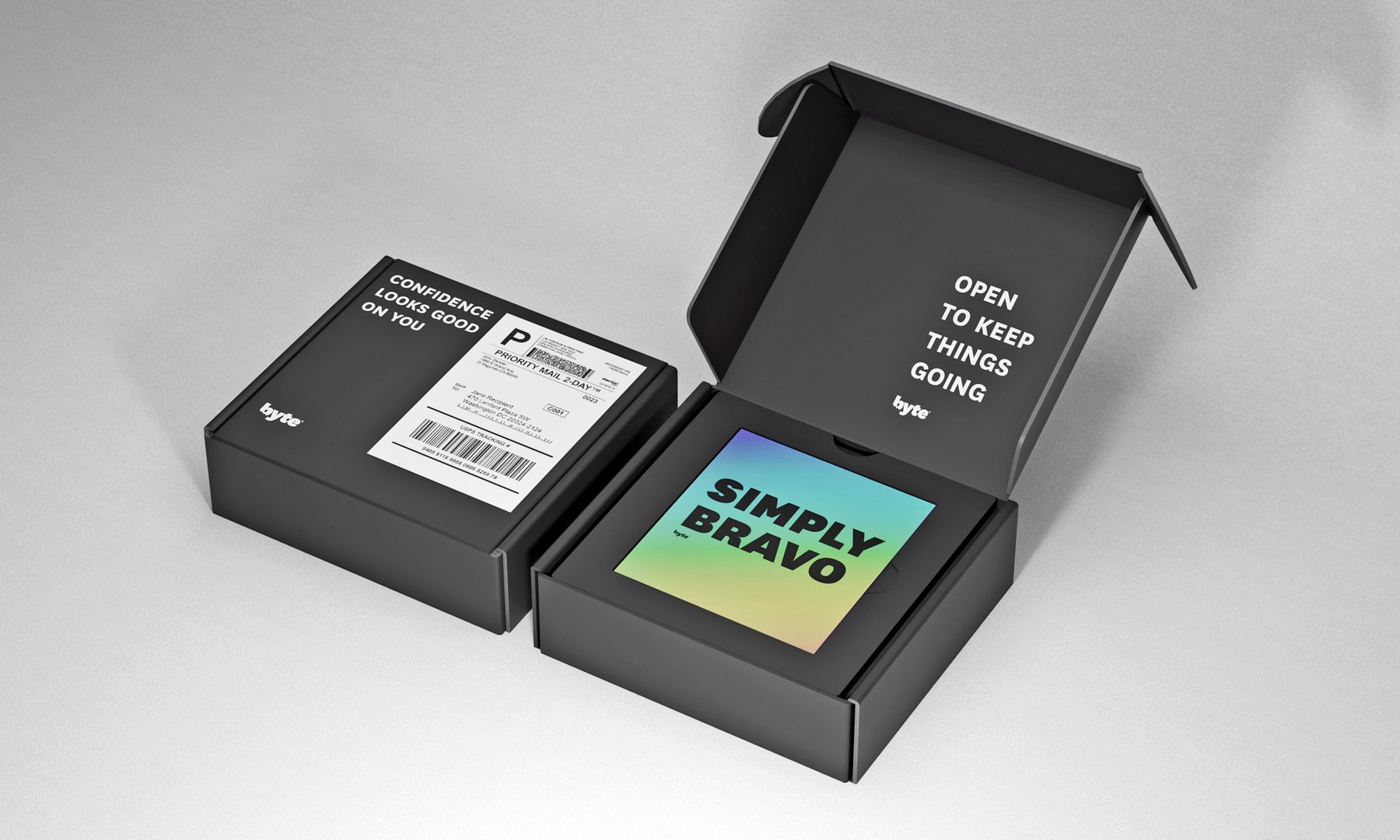
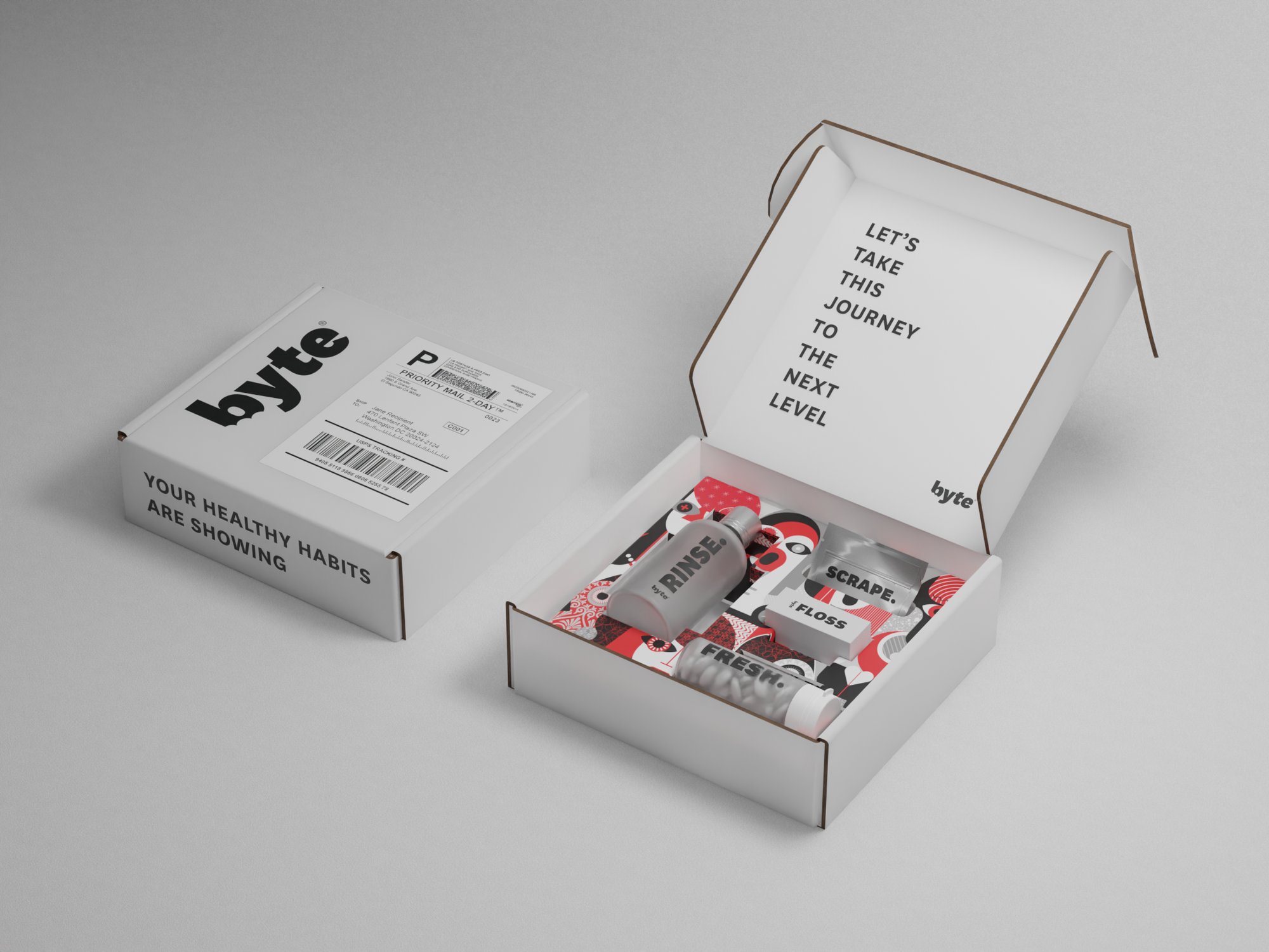
The outer mailer was pure matte black with negative-space typography; inside, full-bleed white with the wordmark deployed at oversized scale. Closed, the shell is a quiet block. Open (hero), the reveal is the brand.

Closed black healthy habits box with circular window showing the white interiorClosed black healthy habits box casting a soft shadow on wood

Window as preview

A circular die-cut let the white interior and a foil edge show before the lid lifted — enough to promise contents without spoiling the oversized wordmark waiting inside.

Black healthy habits box with circular window beside arranged foil packs and bottles

Medical, not clinical

Product photography treated each piece as a museum object — soft lighting, neutral grounds, clean shadows. The goal was trusted medical device without the cold institutional palette of healthcare. Form stayed clinical; staging stayed warm.

Flat lay of byte foil packs, rinse bottles, and tongue scraper on whiteFlat lay of byte bottles, tongue scraper, and floss on white

Foil and bottle, one kit

Secondary stills locked pack architecture: foil sachets for single-use steps, rigid bottles for daily rinse, scraper as the hard silhouette that ties the set together on a white field.

Angled flat lay of byte bottles, tongue scraper, and flossSpread flat lay of byte foil packs and bottles with tongue scraper

Lives in the bathroom

The same object had to read as a gift at the door and as furniture on a vanity. A sink-side frame tested the black shell against tile and towel light — proof it could sit next to everyday objects without looking like a clinic sample.

Black healthy habits box on a bathroom vanity beside a sink

Physical production

Labels, foils, and bottles were assembled as a real kit — not a deck of renders. Process shots kept the system honest: the same mark language had to survive hand application, pack count, and a year on the shelf.

Hands applying byte labels to foil packs on a studio worktable

Outcome

The kit shipped as the subscription’s physical anchor — six labeled products in a black mailer with a white interior reveal, built to hold up in a bathroom cabinet for a full year of reuse.

Credits

Design
Martin Drexler
Studio
Haimish Studio
Client
byte
Duration
2022